SwiftUI: Equal Width Icons
Following on from my previous post on SwiftUI Text alignment, I thought I’d post about another common issue I run into and how to solve it relatively simply: equal width icons. This logic applies to any series of Views you want to display equally in either height or width, but the most common place it occurs in my own code is when using SF Symbols. Each symbol has its own width, so when using them as bullets or in other situations where you want them to line up it can be infuriating.
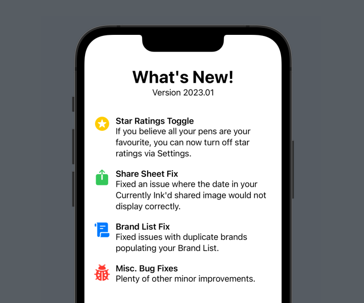
Let’s set the stage with some code. The example I’m using is the ubiquitous “What’s New” sheet, found in many of Apple’s own apps. I’ve borrowed the text and icons from the latest update to Penedex, a pen-tracking app developed by Connor Rose. Here’s the sample View:
struct EqualWidthIcons: View {
    var body: some View {
        VStack(spacing: 20) {

            VStack {
                Text("What's New!")
                    .font(.largeTitle)
                    .bold()
                Text("Version 2023.01")
            }
            .padding(.bottom)

            HStack(alignment: .top) {
                Image(systemName: "star.circle.fill")
                    .font(.title)
                    .foregroundColor(.yellow)
                VStack(alignment: .leading) {
                    Text("Star Ratings Toggle")
                        .font(.headline)
                    Text("If you believe all your pens are your favourite, you can now turn off star ratings via Settings.")
                }
                .fullWidth()
            }

            HStack(alignment: .top) {
                Image(systemName: "square.and.arrow.up.fill")
                    .font(.title)
                    .foregroundColor(.green)
                VStack(alignment: .leading) {
                    Text("Share Sheet Fix")
                        .font(.headline)
                    Text("Fixed an issue where the date in your Currently Ink'd shared image would not display correctly.")
                }
                .fullWidth()
            }

            HStack(alignment: .top) {
                Image(systemName: "scroll.fill")
                    .font(.title)
                    .foregroundColor(.blue)
                VStack(alignment: .leading) {
                    Text("Brand List Fix")
                        .font(.headline)
                    Text("Fixed issues with duplicate brands populating your Brand List.")
                }
                .fullWidth()
            }

            HStack(alignment: .top) {
                Image(systemName: "ladybug.fill")
                    .font(.title)
                    .foregroundColor(.red)
                VStack(alignment: .leading) {
                    Text("Misc. Bug Fixes")
                        .font(.headline)
                    Text("Plenty of other minor improvements.")
                }
                .fullWidth()
            }

            Spacer()
        }
        .padding()
    }
}
A series of repeated sections (don’t worry, it’ll be much neater by the end of the post), each with an icon, a title and a short summary. It makes use of the fullWidth() modifier from my previous post. This is how iOS renders it:
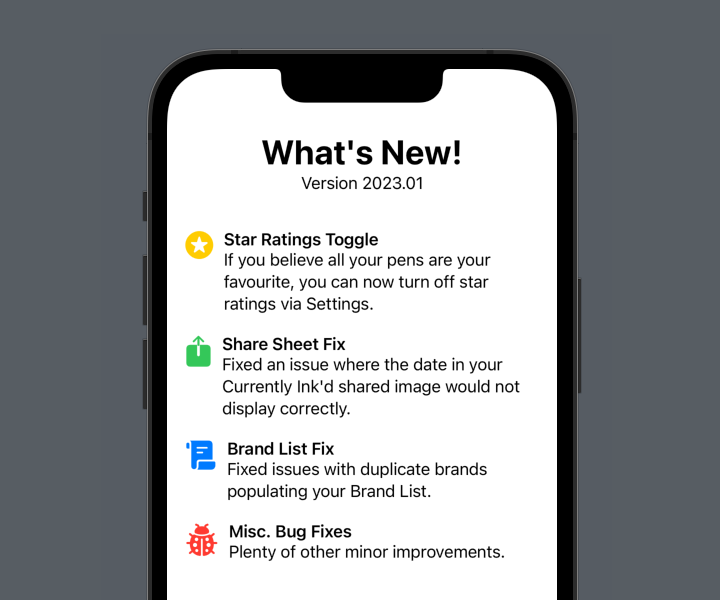
As a starter for ten, this is pretty good! But the scroll icon is wider than the previous two, and the ladybird icon even wider still. This pushes the text out to the right and it no longer lines up. We could manually define a width for the icon:
HStack(alignment: .top) {
    Image(systemName: "square.and.arrow.up.fill")
        .font(.title)
        .foregroundColor(.green)
        .frame(width: 50)
    VStack(alignment: .leading) {
        Text("Share Sheet Fix")
            .font(.headline)
        Text("Fixed an issue where the date in your Currently Ink'd shared image would not display correctly.")
    }
    .fullWidth()
}
(From now on, I’m only going to show the code for one of the four sections. The others are identical in all but the content.)
Yay, that works!
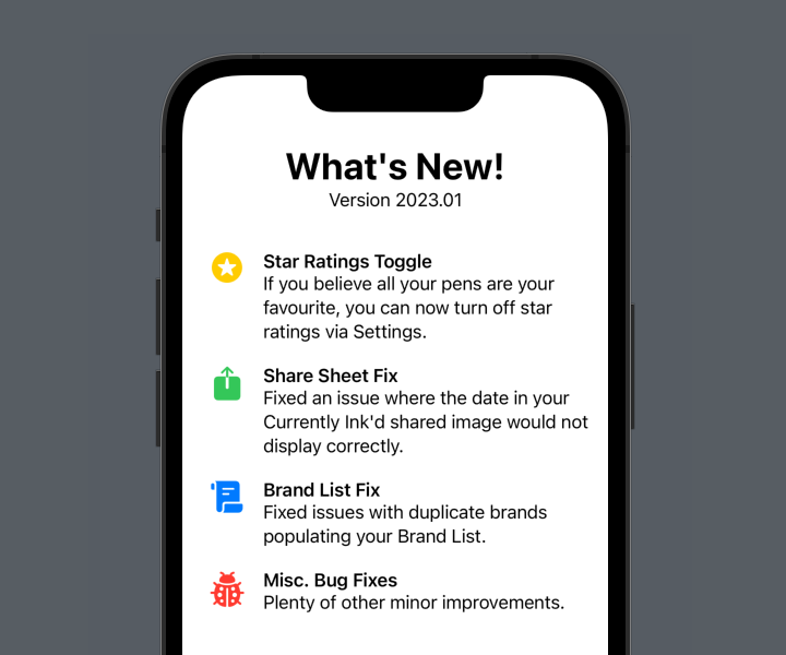
But it’s a bit of a “magic number”, and one that would likely need to be tweaked should you change the icons at a later date. Not to mention that it just won’t scale with the icon if the user adjusts the text size on their iOS device. We can do better than that.
There’s three parts to the solution. We need to:
- read the width of each icon,
- store the maximum of those widths somewhere, and
- set the width of each icon to that maximum.
Let’s take these one at a time.
Read the width of each icon
This is easily achieved using a GeometryReader. I have a bit of a love/hate relationship with this SwiftUI utility, but in this case it works very well. Appyling it as a background to the icon means it will grow to match the size of the icon’s view, and we can read the frame’s size:
Image(systemName: "square.and.arrow.up.fill")
    .font(.title)
    .foregroundColor(.green)
    .background {
        GeometryReader { geo in
            // geo.size.width is the width of the icon
        }
    }
But what we can do with that value?
Store the maximum width
In order to calculate the maximum, we need a couple of things. We need a State variable for the max icon width, and let’s give it a sensible default:
@State private var iconWidth: CGFloat = 20
And we need a way to accumulate the values read by each GeometryReader and take the maximum for our iconWidth variable. SwiftUI provides us with just the thing: a PreferenceKey. This is a strange bit of SwiftUI that allows us to combine a number of values into a single one, and store it somewhere. First, we need to define a custom PreferenceKey, with a reduce function that returns the maximum of the values it is passed. I like to do this on an extension of the main view:
private extension EqualWidthIcons {
    struct IconWidthPreferenceKey: PreferenceKey {
        static let defaultValue: CGFloat = 0
        static func reduce(value: inout CGFloat, nextValue: () -> CGFloat) {
            value = max(value, nextValue())
        }
    }
}
The code here is a little odd, but the important part is the call to max, setting the value variable to the maximum of either what it was before, or the value it has just been passed (the result of the nextValue() call).
Now we need to use this PreferenceKey in our GeometryReader. To do so, we have to call .preference(key:value:) on a View. We can place an invisible view in the GeometryReader and use it there:
Image(systemName: "square.and.arrow.up.fill")
    .font(.title)
    .foregroundColor(.green)
    .background {
        GeometryReader { geo in
            Color.clear.preference(key: EqualWidthIcons.IconWidthPreferenceKey.self, value: geo.size.width)
        }
    }
Applying this to each icon will propagate the maxiumum size up into our EqualWidthIcons.IconWidthPreferenceKey.
Set the width of each icon
Now all that’s left is to set the width of each icon to that maximum. Remember the State variable we created for it previously? We can watch for changes to the PreferenceKey and update it accordingly. I like to do this on the highest view in the hierarchy, the immediate one returned by body (in this case, that’s the outer VStack):
var body: some View {
    VStack {
        // Rest of view...
    }
    .onPreferenceChange(EqualWidthIcons.IconWidthPreferenceKey.self) { value in
        self.iconWidth = value
    }
}
Finally, update each icon to use this value as its width. It’s important that we set the frame after the GeometryReader background.
Image(systemName: "square.and.arrow.up.fill")
    .font(.title)
    .foregroundColor(.green)
    .background {
        GeometryReader { geo in
            Color.clear.preference(key: EqualWidthIcons.IconWidthPreferenceKey.self, value: geo.size.width)
        }
    }
    .frame(width: iconWidth)
And voila! Each icon has the same width, and will scale along with dynamic type as specified by the user.
Cleaning up
This works great, but we have a fair bit of duplicated code. We did already, but since we’ve added the background, GeometryReader, and frame definitions, the sections have become fairly unwieldy. It’s probably time we split it out into its own view:
struct WhatsNewSection: View {

    let icon: String
    let iconColor: Color
    let title: String
    let summary: String

    var body: some View {
        HStack(alignment: .top) {
            Image(systemName: icon)
                .font(.title)
                .foregroundColor(iconColor)
                .background {
                    GeometryReader { geo in
                        Color.clear.preference(key: EqualWidthIcons.IconWidthPreferenceKey.self, value: geo.size.width)
                    }
                }
//              How do we read the iconWidth here?
//              .frame(width: iconWidth)
            VStack(alignment: .leading) {
                Text(title)
                    .font(.headline)
                Text(summary)
            }
            .fullWidth()
        }
    }

}
This dramatically reduces the size of the original view:
struct EqualWidthIcons: View {

    @State private var iconWidth: CGFloat = 20

    var body: some View {
        VStack(spacing: 20) {

            VStack {
                Text("What's New!")
                    .font(.largeTitle)
                    .bold()
                Text("Version 2023.01")
            }
            .padding(.bottom)

            WhatsNewSection(icon: "star.circle.fill", iconColor: .yellow, title: "Star Ratings Toggle", summary: "If you believe all your pens are your favourite, you can now turn off star ratings via Settings.")
            WhatsNewSection(icon: "square.and.arrow.up.fill", iconColor: .green, title: "Share Sheet Fix", summary: "Fixed an issue where the date in your Currently Ink'd shared image would not display correctly.")
            WhatsNewSection(icon: "scroll.fill", iconColor: .blue, title: "Brand List Fix", summary: "Fixed issues with duplicate brands populating your Brand List.")
            WhatsNewSection(icon: "ladybug.fill", iconColor: .red, title: "Misc. Bug Fixes", summary: "Plenty of other minor improvements.")

            Spacer()

        }
        .padding()
        .onPreferenceChange(EqualWidthIcons.IconWidthPreferenceKey.self) { value in
            self.iconWidth = value
        }
    }
}
But you may have noticed the question in the comments in the WhatsNewSection code: where do we read iconWidth from now?
We have to pass it down as a binding from the parent view:
struct WhatsNewSection: View {
    let icon: String
    let iconColor: Color
    let title: String
    let summary: String
    @Binding var iconWidth: CGFloat
    // Rest of view...
Read it as usual to set the icon’s frame:
Image(systemName: icon)
    .font(.title)
    .foregroundColor(iconColor)
    .background {
        GeometryReader { geo in
            Color.clear.preference(key: EqualWidthIcons.IconWidthPreferenceKey.self, value: geo.size.width)
        }
    }
    .frame(width: iconWidth)
And finally, pass the binding through from the main view:
WhatsNewSection(icon: "star.circle.fill", iconColor: .yellow, title: "Star Ratings Toggle", summary: "If you believe all your pens are your favourite, you can now turn off star ratings via Settings.", iconWidth: $iconWidth)
A better alternative
For this particular situation, we can actually do away with the PreferenceKey entirely, if we switch our layout to using a Grid. Grids automatically size the width of their columns based on the widest cell within the column, which is exactly what we want. Here’s a verison of the code using Grid instead:
struct WhatsNewGridRow: View {
    let icon: String
    let iconColor: Color
    let title: String
    let summary: String

    var body: some View {
        GridRow(alignment: .top) {
            Image(systemName: icon)
                .font(.title)
                .foregroundColor(iconColor)
            VStack(alignment: .leading) {
                Text(title)
                    .font(.headline)
                Text(summary)
            }
            .fullWidth()
        }
    }

}

struct GridWidthIcons: View {
    var body: some View {
        VStack(spacing: 20) {
            VStack {
                Text("What's New!")
                    .font(.largeTitle)
                    .bold()
                Text("Version 2023.01")
            }
            .padding(.bottom)

            Grid(horizontalSpacing: 10, verticalSpacing: 10) {
                WhatsNewGridRow(icon: "star.circle.fill", iconColor: .yellow, title: "Star Ratings Toggle", summary: "If you believe all your pens are your favourite, you can now turn off star ratings via Settings.")
                WhatsNewGridRow(icon: "square.and.arrow.up.fill", iconColor: .green, title: "Share Sheet Fix", summary: "Fixed an issue where the date in your Currently Ink'd shared image would not display correctly.")
                WhatsNewGridRow(icon: "scroll.fill", iconColor: .blue, title: "Brand List Fix", summary: "Fixed issues with duplicate brands populating your Brand List.")
                WhatsNewGridRow(icon: "ladybug.fill", iconColor: .red, title: "Misc. Bug Fixes", summary: "Plenty of other minor improvements.")
            }

            Spacer()
        }
        .padding()
    }
}
The result is identical, with a little less code a lot less complexity. However, there are still some situations where you want icons or other views to match widths or heights but a grid isn’t appropriate—there may be other content between the views, for example, that you don’t want conforming to a grid—so the PreferenceKey method is still valuable to know.
The full code for both solutions can be found on Github.
SwiftUI Text Views and Alignment
There’s no doubting that SwiftUI makes app development fast and easy—I certainly wouldn’t have two apps on the store by now without it—but it’s not without its sharp edges and unexpected behaviours.
One of these that I ran into pretty early on is how Text views behave, particularly with regard to alignment and how it lays itself out when text spills over more than one line.
Simple Text views
Putting a bare Text view on the screen, and it’ll be centered by default:
Text("Hello, World!")

Putting a border around the Text view shows us what the boundaries of the view’s frame are, and they hug the text as tightly as possible. The Text‘s frame doesn’t expand to fill all the available space; only what is necessary.
Text("Hello, World!")
    .border(.red)

If the text flows onto multiple lines, it will be left-aligned, and expand to fill the width available before wrapping the text:
Text("Lorem ipsum dolor sit amet, consectetur adipiscing elit, sed do eiusmod tempor incididunt ut labore et dolore magna aliqua.")
    .border(.red)
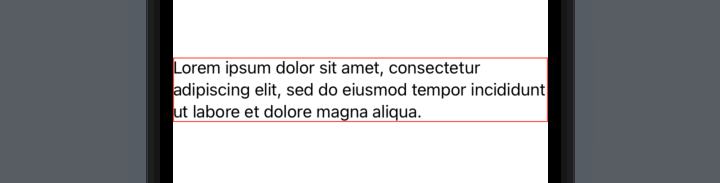
In this particular case, the frame has expanded to fill the entire width of the screen—but this is only because the second line happens to fit exactly. The frame still wants to be centered, as you can see by adjusting the paragraph slightly:
Text("Lorem ipsum dolor sit amet, consectetur adipiscing elit, sed do abore et dolore magna aliqua.")
    .border(.red)

This is often not the behaviour we want from our views! If we had multiple paragraphs, or different sections as part of a stack, they wouldn’t necessarily be aligned with each other, and it’s entirely dependent on exactly what words are in each and where the line breaks fall.
VStack(spacing: 10) {
    Text("Lorem ipsum dolor sit amet, consectetur adipiscing elit, sed do abore et dolore magna aliqua.")
    Text("Lorem ipsum dolor sit amet, sed do abore dolore magna aliqua.")
}
.padding()

With the borders on, you can clearly see what’s going on:
VStack(spacing: 10) {
    Text("Lorem ipsum dolor sit amet, consectetur adipiscing elit, sed do abore et dolore magna aliqua.")
        .border(.red)
    Text("Lorem ipsum dolor sit amet, sed do abore dolore magna aliqua.")
        .border(.green)
}
.padding()

A real world example
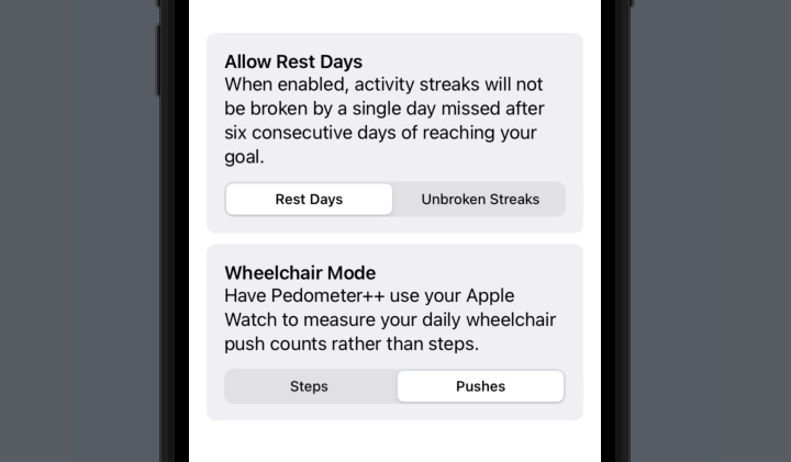
Let’s use a less contrived example: a settings page, with multiple different settings each with explanatory text. For lack of imagination, I’ve borrowed the settings and text from _DavidSmith‘s Pedometer++ app (inspired by a recent post in his excellent Design Notes Diary series).
VStack(spacing: 10) {
    GroupBox {
        HStack {
            Text("Allow Rest Days")
                .font(.headline)
            Spacer()
        }
        Text("When enabled, activity streaks will not be broken by a single day missed after six consecutive days of reaching your goal.")
        Picker("Allow Rest Days", selection: $allowRestDays) {
            Text("Rest Days").tag(true)
            Text("Unbroken Streaks").tag(false)
        }
        .pickerStyle(.segmented)
    }
    GroupBox {
        HStack {
            Text("Wheelchair Mode")
                .font(.headline)
            Spacer()
        }
        Text("Have Pedometer++ use your Apple Watch to measure your daily wheelchair push counts rather than steps.")
        Picker("Wheelchair Mode", selection: $allowRestDays) {
            Text("Steps").tag(false)
            Text("Pushes").tag(true)
        }
        .pickerStyle(.segmented)
    }
}
.padding()
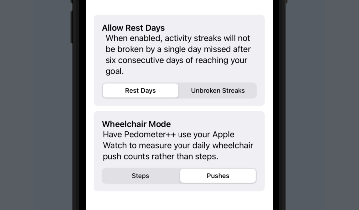
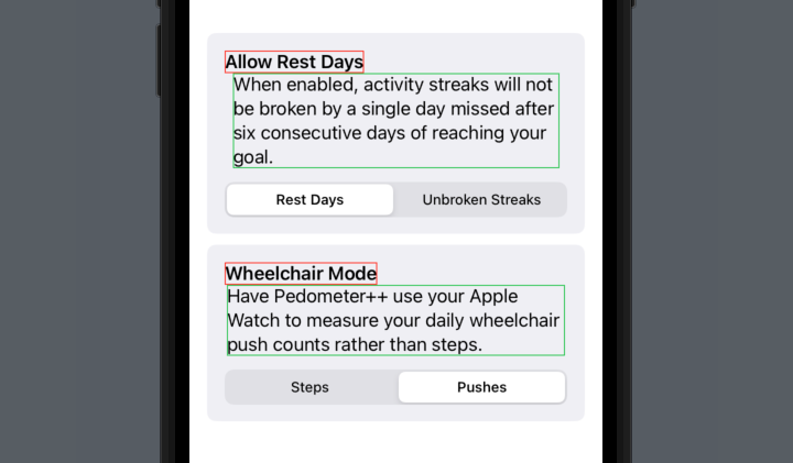
In order to left-align the settings headers, I’ve wrapped them in an HStack and followed them by a Spacer. There is a better way that we’ll come to later, but for now you can clearly see that the two explanatory paragraphs don’t align with each other, or with their surrounding content!
Adding borders in, it’s obvious why:
Fixing the alignment problems
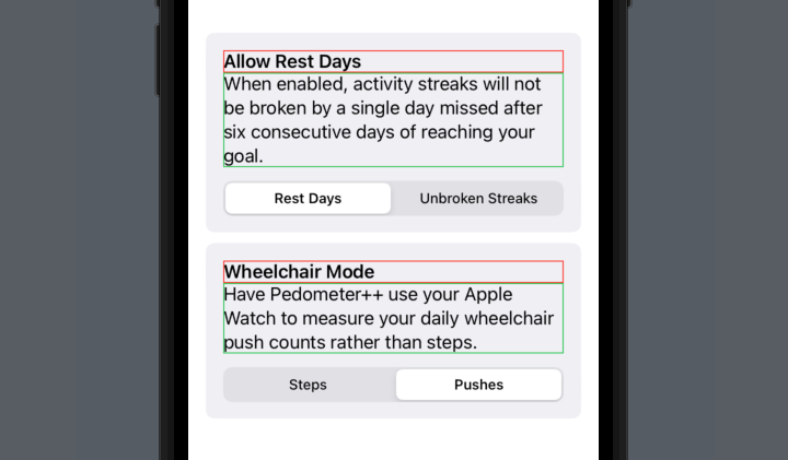
We could fix this in the same way that we pushed the titles to the left - but a better way would be to use the frame modifier on the Text views to tell them to expand to take all available space horizontally, rather than just what they require. This is a technique we can also use on the headings.
We can do this by using .frame(minWidth: 0, maxWidth: .infinity, alignment: .leading), telling SwiftUI that we want the frame to fill the entire width of its container, and align the text inside it to the left. In the code below, I’ve added it to four places: the two headers, and the two paragraphs.
VStack(spacing: 10) {
    GroupBox {
        Text("Allow Rest Days")
            .font(.headline)
            .frame(minWidth: 0, maxWidth: .infinity, alignment: .leading)
        Text("When enabled, activity streaks will not be broken by a single day missed after six consecutive days of reaching your goal.")
            .frame(minWidth: 0, maxWidth: .infinity, alignment: .leading)
        Picker("Allow Rest Days", selection: $allowRestDays) {
            Text("Rest Days").tag(true)
            Text("Unbroken Streaks").tag(false)
        }
        .pickerStyle(.segmented)
    }
    GroupBox {
        Text("Wheelchair Mode")
            .font(.headline)
            .frame(minWidth: 0, maxWidth: .infinity, alignment: .leading)
        Text("Have Pedometer++ use your Apple Watch to measure your daily wheelchair push counts rather than steps.")
            .frame(minWidth: 0, maxWidth: .infinity, alignment: .leading)
        Picker("Wheelchair Mode", selection: $allowRestDays) {
            Text("Steps").tag(false)
            Text("Pushes").tag(true)
        }
        .pickerStyle(.segmented)
    }
}
.padding()
Once again, putting the borders back in, it’s clear what’s now going on:
A brief note about the way
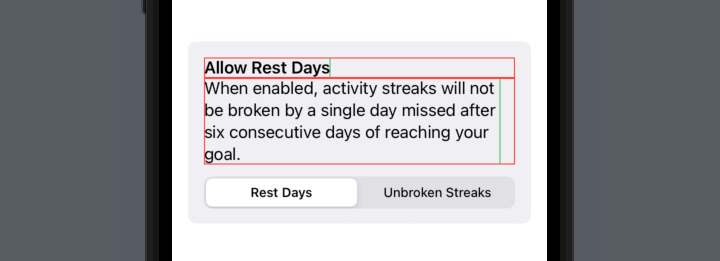
alignment:works within theframemodifier: it is not for aligning the text, it is for aligning the view within the frame. When we say.frame(minWidth: 0, maxWidth: .infinity, alignment: .leading), despite what it looks like, we’re not actually asking SwiftUI to change the size of theTextview—instead, we’re asking SwiftUI to place that view within a frame that takes up the specified space, and place it at the left of the space. If we put a border around theTextview before the frame modifier (green), and another after (red), we can see what SwiftUI is doing under the hood:
Text("Allow Rest Days")
    .font(.headline)
    .border(.green)
    .frame(minWidth: 0, maxWidth: .infinity, alignment: .leading)
    .border(.red)
Text("When enabled, activity streaks will not be broken by a single day missed after six consecutive days of reaching your goal.")
    .border(.green)
    .frame(minWidth: 0, maxWidth: .infinity, alignment: .leading)
    .border(.red)
A neat solution
In fact, this is such a common thing I want to do to Text views within my apps, that I’ve written a small view modifier to handle it. Typing .frame(minWidth: 0, maxWidth: .infinity, alignment: .leading) in so many places is a pain in the backside.
struct FullWidthText: ViewModifier {

    var alignment: TextAlignment = .leading

    var frameAlignment: Alignment {
        switch alignment {
        case .leading:
            return .leading
        case .trailing:
            return .trailing
        case .center:
            return .center
        }
    }

    func body(content: Content) -> some View {
        content
            .multilineTextAlignment(alignment)
            .frame(minWidth: 0, maxWidth: .infinity, alignment: frameAlignment)
    }
}

extension View {
    func fullWidth(alignment: TextAlignment = .leading) -> some View {
        modifier(FullWidthText(alignment: alignment))
    }
}
Now we can clean up our previous code, producing the same result but with a much neater and easier to remember view modifier:
VStack(spacing: 10) {
    GroupBox {
        Text("Allow Rest Days")
            .font(.headline)
            .fullWidth()
        Text("When enabled, activity streaks will not be broken by a single day missed after six consecutive days of reaching your goal.")
            .fullWidth()
        Picker("Allow Rest Days", selection: $allowRestDays) {
            Text("Rest Days").tag(true)
            Text("Unbroken Streaks").tag(false)
        }
        .pickerStyle(.segmented)
    }
    GroupBox {
        Text("Wheelchair Mode")
            .font(.headline)
            .fullWidth()
        Text("Have Pedometer++ use your Apple Watch to measure your daily wheelchair push counts rather than steps.")
            .fullWidth()
        Picker("Wheelchair Mode", selection: $wheelchairMode) {
            Text("Steps").tag(false)
            Text("Pushes").tag(true)
        }
        .pickerStyle(.segmented)
    }
}
.padding()
As you may have noticed, it also supports providing the other TextAlignment options for multiline text, passed to the .fullWidth(alignment:) videw modifier: .leading (the default), .centered, and .trailing.
Hopefully this can be of some use to you and help clear up some of the oddities surrounding the layout of text in SwiftUI! If you do find it helpful, I’d love for you to let me know.
Diamine Inkvent 2022
The Diamine Inkvent advent calendars are something I never imagined existed—24 small 12ml bottles of unique ink, and one 30ml bottle on Christmas Day. 2022 was the second year they produced one, and although I didn’t buy one for advent itself, I did pick one up at half price a couple of days after Christmas from Cult Pens.
The little 12ml bottles are adorably cute, and all the inks are somewhat Christmas- or winter-themed in name. I opened the calendar all in one go, and spent half an hour one afternoon swatching every ink. I can recommend a dip pen if you’re going to do this—I used a Lamy Safari, dipping the nib into each bottle in turn, but thanks to the feed it was a bit more of a pain to clean between inks than a proper dip pen would have been.
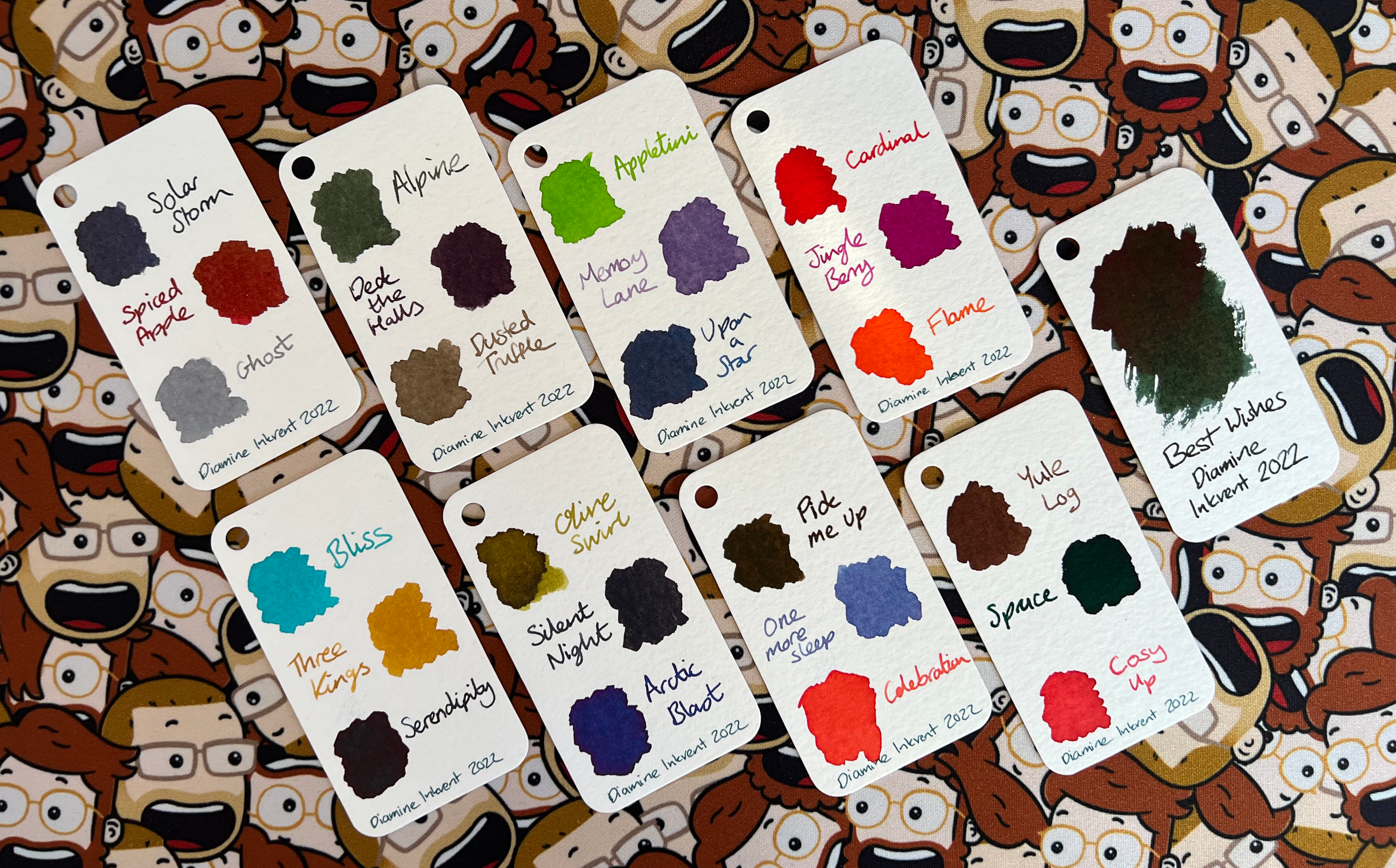
I swabbed three to a swatch for my homemade col-o-ring, and gave the large 30ml bottle its own. These are cards I’ve cut from 350gsm watercolour postcards, rounded the corners using a corner punch, and punched a hole in to thread them through a keyring. The result is a fantastic way to flick through my available inks and make a choice, and I love having it as something to play with sitting on my desk:
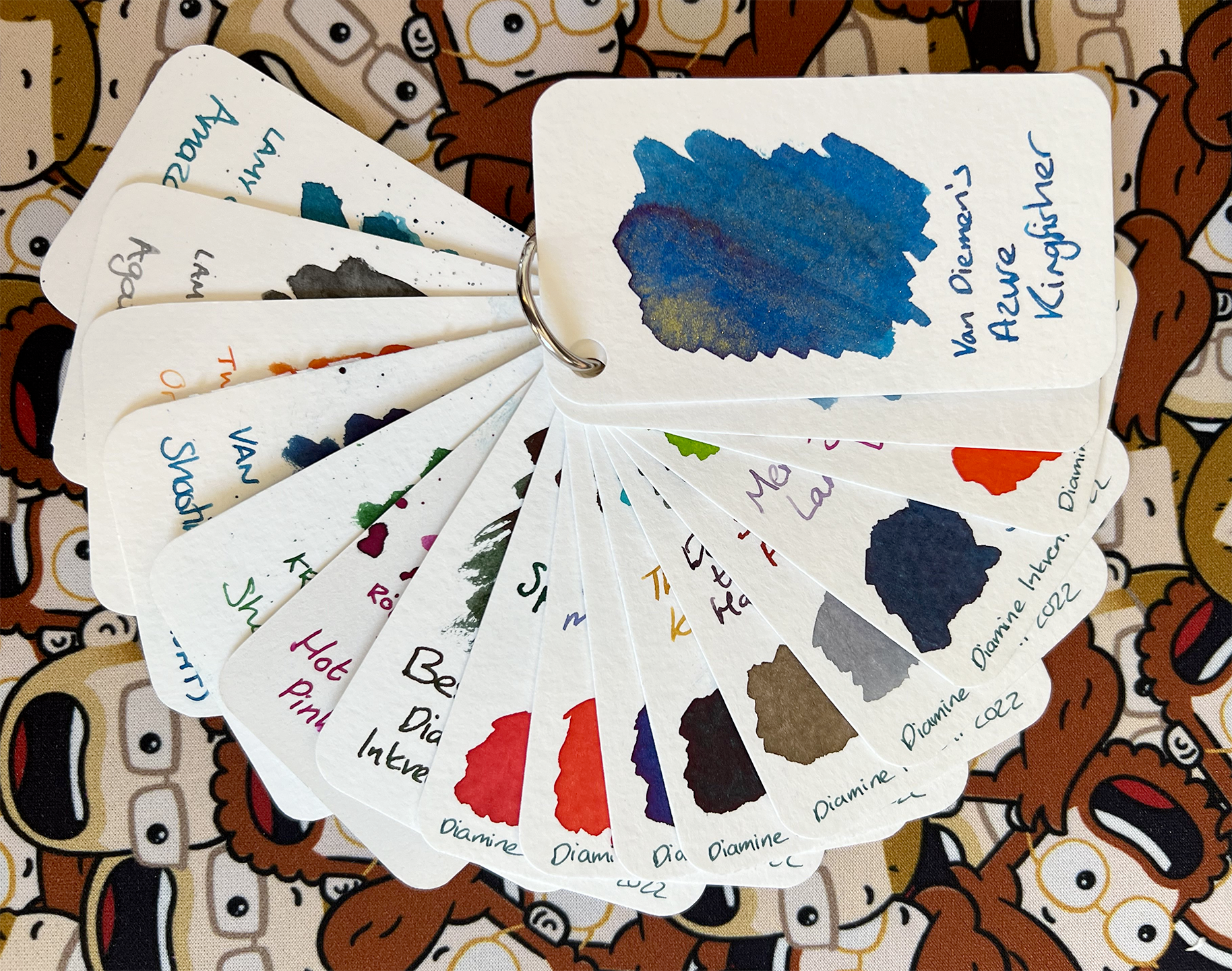
Speaking of which, how beautiful is that Van Diemen’s Azure Kingfisher from the Wilderness Series? It has such a beautiful golden shimmer and a slight red sheen. It was a birthday gift from a couple of wonderful friends, along with a custom pen from Just Turnings that matches it perfectly, and shows off its properties fantastically with a broad nib.
I’m not sure I’m likely to buy the advent calendar full price next Christmas—it is a fair amount of money, and I have many inks I still haven’t used yet from it—but I think they’re a fantastic idea from Diamine. Judging by last year, they’ll be selling each of the colours individually later in the year in larger bottles, so if there’s any that really take my fancy I don’t need to worry about 12ml not going particularly far.
So far, my favourite is Flame, but I am particularly partial to a good orange. What’s yours?
Swift Charts & Calendar Weekdays
I’ve recently been working on adding a statistics section to Pendulum, the pen pal tracking app I develop with my friend Alex. This seemed like the perfect opportunity to use Swift Charts, Apple’s new charting framework.
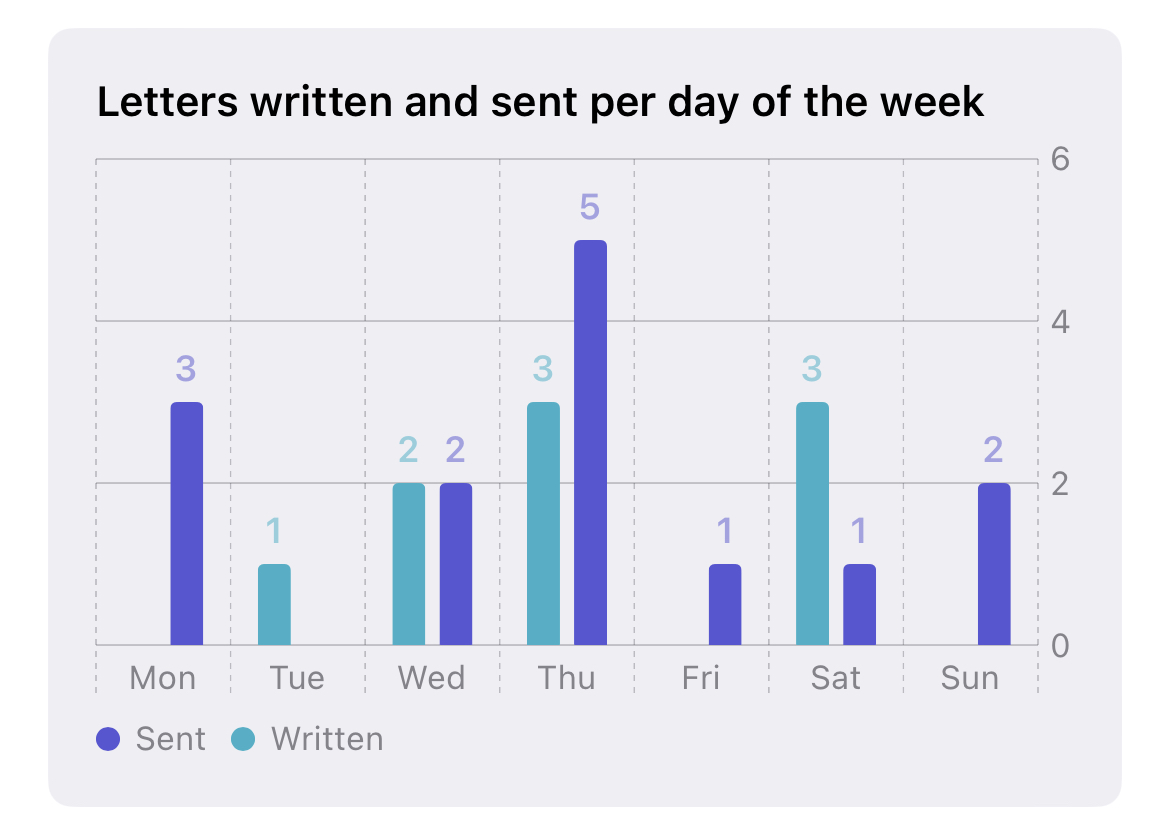
I ultimately wanted to end up with a graph like the following:
Swift Charts can perfectly handle multiple datasets on one graph, but the problem I ran into was that it doesn’t seem to have a way to natively aggregate data per day of the week. If I only had seven days worth of data, it would be fine—I could display just the day name on the axis, and no days would be repeated because I wouldn’t be displaying more than a week of data. However, as I want to aggregate every event, this wasn’t going to work. I decided to do the grouping of the data myself, and just pass Swift Charts a pre-binned dataset for it to present, where it wouldn’t have to worry about dates at all.
I had one other problem I wanted to solve: I wanted the graph to start on whatever the current locale thinks the start of the week is1. For us in the UK and Europe, we generally consider Monday the beginning of the week, as reflected in the graph above. But for the US, it should probably start with Sunday.
In order to generate the seven “bins” for the chart to show, I could use the handy Calendar.current.shortWeekdaySymbols property, which produces an array of the shortened names of the week, properly localised to the user’s current locale. However, regardless of locale, this array always starts with Sunday and ends with Saturday. There’s another property of the calendar, .firstWeekday, that returns a number between 1 (for Sunday) and 7 (for Saturday) representing what the locale considers to be the first day of the week. Using this, I can shift the array from shortWeekdaySymbols to produce the output in the right order. I decided to wrap both these pieces of information up in an enum to represent each day of the week:
enum Weekday: Int, CaseIterable {
    case sun = 1
    case mon = 2
    case tue = 3
    case wed = 4
    case thu = 5
    case fri = 6
    case sat = 7

    var shortName: String {
        return Calendar.current.shortWeekdaySymbols[self.rawValue - 1]
    }

    static var orderedCases: [Weekday] {
        Self.allCases.shiftRight(by: Calendar.current.firstWeekday - 1)
    }
}
You’ll also notice I’m using an extension to Array that allows me to shift an array, wrapping the values around to the end as they get popped off the front:
extension Array {
    func shiftRight(by: Int = 1) -> [Element] {
        guard count > 0 else { return self }
        var amount = by
        assert(-count...count ~= amount, "Shift amount out of bounds")
        if amount < 0 { amount += count }
        return Array(self[amount ..< count] + self[0 ..< amount])
    }
}
Now that I have an enum I can use to represent the days of the week correctly, and order them as defined by the user’s locale, I needed to use this somehow to generate data to pass to the chart. I started off by defining a struct to hold a single datapoint:
struct StatusCountByDay: Identifiable {
    let status: EventType
    let day: Weekday
    let count: Int
    var id: String { "\(day)-\(status.rawValue)" }
}
Here, EventType is an internal enum used by Pendulum to mark whether the event was a letter being sent, written, received, etc. What makes each data point unique in the chart is the combination of the day of the week, and the event type, so I combine those two together as the id for the struct.
Next, I needed to fetch the data and group it into buckets:
var days: [Weekday: [Event]] = [:]

for event in Event.fetch(withStatus: [.written, .sent]) {
    if !days.keys.contains(event.wrappedDate.weekday) {
        days[event.wrappedDate.weekday] = []
     }
     days[event.wrappedDate.weekday]?.append(event)
}
I start by defining a dictionary mapping weekdays to an array of events, and then looping over the events I’m interested in and adding them to the corresponding weekday key in the dictionary. This necessitated another extension to a Foundation object, this time on Date2:
extension Date {
    var dayNumberOfWeek: Int? {
        return Calendar.current.dateComponents([.weekday], from: self).weekday
    }
    var weekday: Weekday {
        return Weekday(rawValue: dayNumberOfWeek ?? 0) ?? .sun
    }
}
This uses the .weekday date component from the user’s current calendar, which returns the same 1–7 index as used by .firstWeekday, and returns the corresponding Weekday object.
With the data correctly bucketed, it was time to sum up the series and create the datapoints for the chart. When the data provided is not sequential (such as a series of dates) but is instead discrete (such as list of names, for example) Swift Charts will draw the bars in the order in which it first encounters them. You may think that weekdays are sequential—and you’d be right—but in this case, they’re not an object that Swift Charts understands in that way. So to draw the chart as intended, we need to create a StatusCountByDay instance for each weekday in the order we want. We also need to include one even when the count for that day is zero, because we don’t want the chart to just skip a day. I do this by looping over the weekdays ordered according to the locale, inside that looping over each event type, and calculating the sum for each:
var results: [StatusCountByDay] = []
for eventType in [EventType.written, EventType.sent] {
    for day in Weekday.orderedCases {
        let count = (days[day] ?? []).filter { $0.type == eventType }.count
        results.append(StatusCountByDay(status: eventType, day: day, count: count))
    }
}
Ultimately, we end up with a series of data like the following:
[
    StatusCountByDay(status: .sent, day: .sun, count: 2),
    StatusCountByDay(status: .sent, day: .mon, count: 0),
    StatusCountByDay(status: .sent, day: .tue, count: 1),
    StatusCountByDay(status: .sent, day: .wed, count: 5),
    StatusCountByDay(status: .sent, day: .thu, count: 12),
    StatusCountByDay(status: .sent, day: .fri, count: 5),
    StatusCountByDay(status: .sent, day: .sat, count: 1),
    StatusCountByDay(status: .written, day: .sun, count: 3),
    StatusCountByDay(status: .written, day: .mon, count: 2),
    StatusCountByDay(status: .written, day: .tue, count: 2),
    StatusCountByDay(status: .written, day: .wed, count: 1),
    StatusCountByDay(status: .written, day: .thu, count: 2),
    StatusCountByDay(status: .written, day: .fri, count: 1),
    StatusCountByDay(status: .written, day: .sat, count: 10)
]
All that’s left is to pass that to Swift Charts, for which I’ll break down each section after I show the code:
Chart(results) { data in
    BarMark(
        x: .value("Day", data.day.shortName),
        y: .value("Count", data.count)
    )
    .annotation(position: .top, alignment: .top) {
        if data.count != 0 {
            Text("\(data.count)")
                .font(.footnote)
                .bold()
                .foregroundColor(data.status.color)
                .opacity(0.5)
        }
    }
    .foregroundStyle(by: .value("event", data.status.actionableTextShort))
    .position(by: .value("event", data.status.actionableTextShort))
}
.chartForegroundStyleScale([
    EventType.sent.actionableTextShort: EventType.sent.color,
    EventType.written.actionableTextShort: EventType.written.color,
])
Firstly, we want a bar chart, so the correct type of mark to use is a BarMark. The x axis is the short name of the weekday (“Mon”, “Tue”, etc), and the y axis is the count.
The .annotation section puts the little figures above each bar, and isn’t particularly necessary but I liked the way it looked.
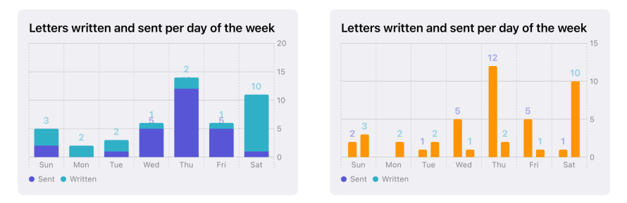
The two BarMark modifiers .foregroundStyle(by:) and .position(by:) both tell Swift Charts how to define and handle each series independently; otherwise, they’d be a single bar, stacked on top of each other within each day. Grouping them by event type, the first modifier tells them to be different colours, and the second puts them as independent bars side by side instead of on top of each other. I use data.status.actionableTextShort as the value to distinguish the data by, because that is what I want shown in the legend beneath the chart (“Sent” vs “Written”, etc).
You can see below the results of the chart without the .position(by:) modifier, and without the .foregroundStyle(by:) modifier, respectively.
Finally, the .chartForegroundStyleScale modifier defines the colours to be used for each series, which is a dictionary mapping the name of the series to its colour. In this case, I use want them using the colour defined for the event type, to keep it consistent with the rest of the app.
I’m quite impressed with Swift Charts and how easy it makes drawing a good looking chart, but there are definitely some things that could be more obvious about it. The lack of decent documentation with plenty of examples and screenshots being a very clear area for improvement!
-
Yes, I realise none of the rest of the app is localised. Baby steps, though! ↩
-
As you may have realised by now, I’m quite a fan of writing extensions to standard types for common functions that could end up being performed regularly. They make the rest of the code a lot cleaner. It’s one of my favourite features of Swift. ↩
Review: LEGO Monster Jam Trucks
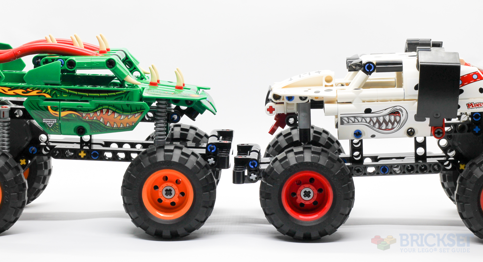
Recently, two more reviews of mine went up on Brickset: one for 42149 Monster Jam Dragon and the other for its counterpart, 42150 Monster Jam Monster Mutt Dalmation. They’re part of a small series that LEGO has released over the past few years, with two pull-back-and-go Technic monster trucks from the Monster Jam sport. Spoilers for the reviews, but I think they’re great little “intro to Technic” sets, and you can’t go wrong at less than £18.
Review: 40651 Australia Postcard
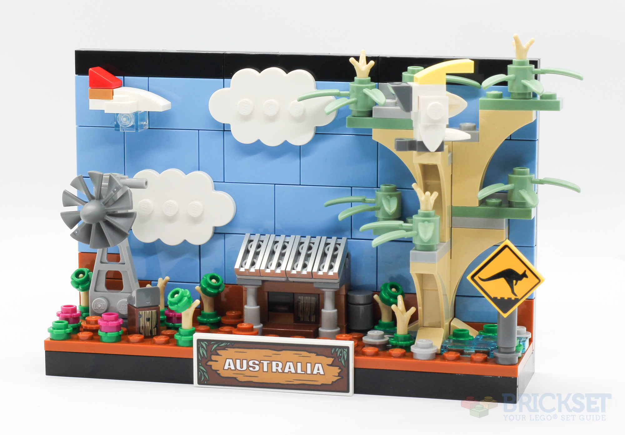
I’ve quite liked the previous sets in the LEGO Postcard series, so it was good to get a chance to review the latest, 40651 Australia, even if it’s a slight departure from the rest:
The designers have chosen to represent the entirety of Australia with a small shack, a windpump, an outdoor toilet, a large tree with a cockatoo, and a sign warning of kangaroos. There’s also a Qantas plane flying through the bright blue sky, and small colourful plants growing around the ground.
Brickset LEGO Gift Guide - $50 and up
The last two holiday gift guides have been published at Brickset, where we’ve chosen a number of sets in a variety of price brackets. Go and check out the sets between $50 to $100, $100 to $200, and $200 and up!
Brickset LEGO Gift Guide
Brickset have started publishing their annual Gift Guide, and this year Huw asked for my thoughts to be included. So far, guides for the first two price ranges have been released, for sets under $25 and sets priced between $25 and $50. Click through to see my recommendations!

Review: 71409 Big Spike's Cloudtop Challenge
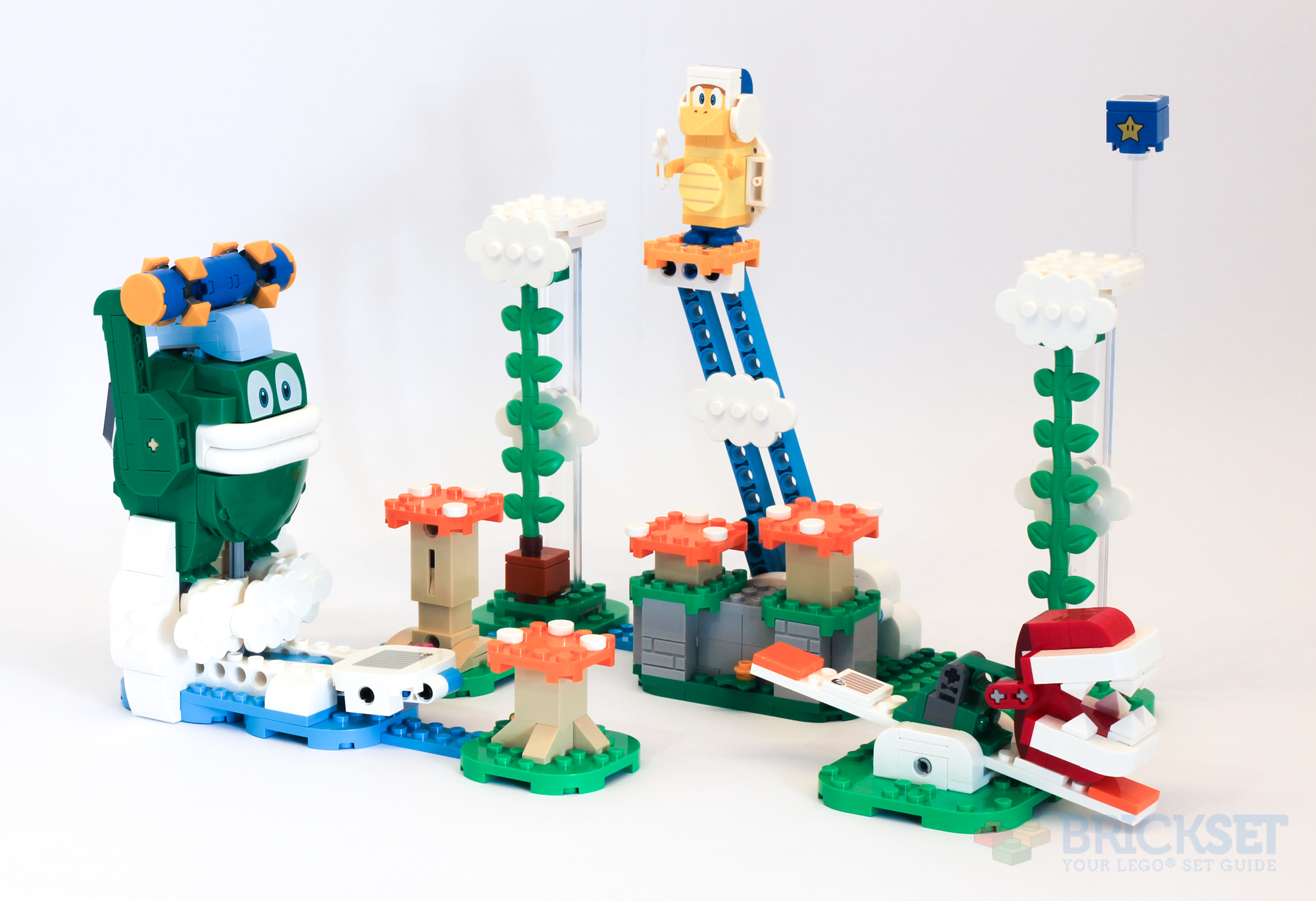
The last of this round of Super Mario LEGO sets to review, 71409 Big Spike’s Cloudtop Challenge:
LEGO keep on producing Super Mario expansion sets to add to what is clearly a popular theme for them—this year they have released 14 distinct sets in the range so far. 71409 Big Spike’s Cloudtop Challenge is one of the largest, with 540 parts, and packs a decent punch: three opponents, two of which are new, and some fun takes on the interactivity and game play we’ve come to expect with these sets.
LEGO IDEAS Review Results
LEGO have announced the results of the latest IDEAS review (the mechanism by which fan-designed models can get made into real LEGO sets, should they reach 10,000 votes and pass the review). Four projects were accepted this time, and I particularly like the look of the Space Age designs, which will hopefully be an instant buy when it eventually comes out some time in 2023/2024. The other three ideas also look fantastic, and it will be interesting to see how LEGO adapts them to become production-ready sets. I hope they include Chris McVeigh on the team designing the Polaroid, as that is right up his alley!